Choosing your wedding color palette is one of the most exciting parts of planning your big day. Your colors influence everything — from florals and bridesmaid dresses to décor, invitations, and even your photography style. As a Dallas wedding photographer, I’ve seen firsthand how the right seasonal color theme can completely transform a wedding and make your photos look timeless.
If you’re wondering how to match your wedding colors to the time of year, this guide will help you choose the perfect palette for a cohesive, stunning celebration.
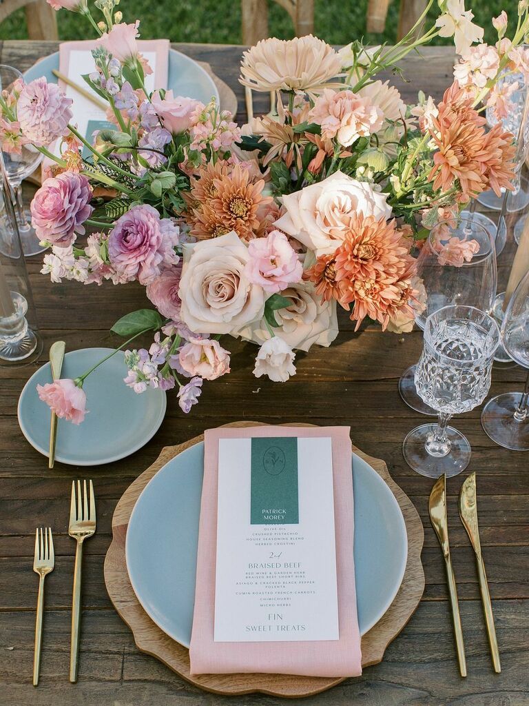
🌸 Spring Weddings: Soft, Romantic & Fresh


4
Spring is all about renewal, blooms, and soft romance. Think light, airy tones that complement fresh florals and outdoor garden venues.
Popular Spring Color Palettes:
- Blush & Sage Green
- Lavender & Dusty Blue
- Peach & Champagne
- Soft Yellow & Ivory
These colors photograph beautifully in natural light — especially during golden hour. Light pastels reflect sunlight in a flattering way, which is why many couples working with a Dallas wedding photographer choose outdoor venues in spring.
Pro Tip: Incorporate seasonal florals like peonies, tulips, and ranunculus to enhance your palette naturally.
☀️ Summer Weddings: Bold, Bright & Vibrant


4
Summer weddings in Texas are vibrant and full of energy. This is the season to embrace bold colors that pop against blue skies and glowing sunsets.
Popular Summer Color Palettes:
- Coral & Turquoise
- Fuchsia & Orange
- Royal Blue & Gold
- Bright Pink & Emerald
Because summer sunlight is stronger, bold tones photograph beautifully without looking washed out. Bright florals and colorful bridesmaid dresses create dynamic images that stand out in your wedding album.
Pro Tip: If you’re planning a summer wedding in Dallas, consider indoor venues with neutral walls to balance strong colors and keep your photos timeless.
🍂 Fall Weddings: Warm, Rich & Earthy


4
Fall weddings are incredibly popular — especially in Texas — because of the comfortable weather and warm, romantic tones.
Popular Fall Color Palettes:
- Burgundy & Gold
- Burnt Orange & Navy
- Terracotta & Cream
- Emerald & Copper
These deeper tones create dramatic, emotional imagery. As a Dallas wedding photographer, fall lighting combined with rich color palettes produces some of the most stunning, cinematic wedding portraits.
Pro Tip: Add texture with velvet linens, wood accents, and candlelight to enhance those cozy autumn vibes.
❄️ Winter Weddings: Elegant, Moody & Sophisticated


4
Winter weddings feel luxurious and intimate. This is the season for dramatic contrasts and elegant neutrals.
Popular Winter Color Palettes:
- Navy & Silver
- Black & White
- Emerald & Gold
- Deep Red & Ivory
Winter color schemes often pair beautifully with candlelight, ballroom venues, and black-tie attire. Darker palettes create stunning contrast in photos, especially in evening receptions.
Pro Tip: Metallic accents (gold, silver, or copper) add dimension and reflect light beautifully in your wedding photography.
How to Make Sure Your Colors Look Amazing in Photos
No matter the season, keep these key tips in mind:
1. Consider Your Venue
Your venue’s walls, flooring, and lighting will influence how your colors appear. Neutral venues allow more flexibility, while bold venues may require softer palettes.
2. Think About Lighting
Natural light enhances pastels and bright tones, while candlelight and indoor lighting elevate deeper, moodier shades.
3. Keep It Cohesive
Choose 2–3 main colors and 1–2 accent tones. Too many colors can feel overwhelming and chaotic in photos.
4. Don’t Forget Your Skin Tones
Make sure your bridesmaid dresses and florals complement everyone in your wedding party.
5. Ask Your Photographer
An experienced Dallas wedding photographer understands how different color palettes translate on camera and can guide you toward choices that will look timeless in your wedding gallery.
Final Thoughts
Your wedding color theme sets the tone for your entire celebration. By choosing a palette that complements the season, your venue, and your overall vision, you’ll create a wedding day that feels cohesive, intentional, and beautifully photographed.
If you’re planning your big day and looking for a trusted Dallas wedding photographer who can help guide you through everything from timelines to color coordination, Hillery’s Photography would love to capture your story.
Let’s create something timeless together. 💍✨